I have moved groups now as we thought I would work better with my new group.
This is their first cut:
The improvements for their first cut are:
-To include a shot reverse shot(over the shoulder)
-To include match on action
-The 180 degree rule was broken at 00:00:51
-More varied angles need to be used
-The framing needs improving. In one scene the top of her head was cut off and so was her chin.
Wednesday 18 December 2013
Monday 16 December 2013
Continuity Task - First Cut
This is our first attempt at our continuity editing task. We are going to have to film another one as there are quite a few improvments we need to make. In our extreme close up, which was the establishing shot we didn't focus on one part of the head and also we cut off the top of her head in the shot after that. We also didn't include any match on action and our shot reverse shot wasn't done to the best of our ability. These are the main things we are going to have to focus on when we re film it. It is important that we pick out our weaknesses now as when it comes to making the real thing we have had practice and we know what we need improve on.
Friday 13 December 2013
Typography


Above are some fonts that can be used in thrillers,usually used for the title of the film. In the title sequence they also use quite simple/minimalistic fonts for names in the opening, some of the minimalistic texts are animated with the style of the movie.
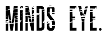
We are thinking of using,the ALCATRAZ.ISLAND.CA.FONT as its professional looking and fits into the genre,psychological thriller. We ended up with this font as we watched the Shutter island opening and like the font used, we then decided we would use a simple but eye grabbing bold font.
We ended up with the ALXATRAZ.ISLAND font, this font is similer to shutter islands but slighty modified. The other fonts we looked at also would not have fitted in with the possible story lines we had chosen.
Possible movie titles using the chosen font:


Finding out about typography is useful because we know what types of fonts are used in thrillers and when it comes to making our opening we have already got a good idea of what font we are going to use.
Thursday 12 December 2013
The Evaluation Questions
In the evaluation the following questions must be answered:
• In what ways does your media product use, develop or challenge forms and conventions of real media products?
• How does your media product represent particular social groups?
• What kind of media institution might distribute your media product and why?
• Who would be the audience for your media product?
• How did you attract/address your audience?
• What have you learnt about technologies from the process of constructing this product?
• Looking back at your preliminary task, what do you feel you have learnt in the progression from it to the full product?
It is useful for me to know these questions now as while I do each peice of work I can do a small evaluation of it, then when it comes to the real evaluation I can just expand on what I have already done instead of going through all my work again.
Wednesday 4 December 2013
Continuity Editing Task

Subscribe to:
Posts (Atom)