The research we did before we started any filming was an important part of the process. It taught us more about the thriller genre and its sub genres so we could decide what sub genre we wanted to use. From our research we liked the idea of doing a Film Noir. The research we did into this was important because it taught us the typical codes and conventions that Film Noir use so that we could use them in our own work.
From the research we started the planning process. We made mind maps to help organise our ideas and lay them out in a way so we could see our ideas and review them to decide which idea was the best to use. We chose the cinema idea from our mind map to use as the narrative for our opening however, the narrative changed a lot throughout the process to suit our settings we had and our characters so we didn't stick to the original idea, it had to be adapted. Storyboarding was important because it helped us to lay out the sequence of our opening in detail however, we didn't make our storyboard very detailed which meant we had to redo it a couple of times so we had a more detailed plan to refer to when we were filming. During the filming process we didn't refer to our storyboard much to help us which probably slowed us down when filming as we didn't stick to a set plan, we hadn't organised the shots we were going to use so we were making up what we were doing more on the spot instead of referring to a detailed storyboard. We also practised shot we could use, which we had learnt are conventions of film noir like the dutch tilt, so we could try to include them in our opening to make it look effective.
Friday 25 April 2014
Monday 21 April 2014
Thursday 10 April 2014
Order of our titles
This is the order titles should appear in a title sequence:
- The logo of the production company should appear first.
- Followed by the studio.
- "A Film By" should be next, for us this would be - A Film By
-Jade Dockerill
- Prada Nayar
- Emily Hardy
- Tiffany Leung
- This is then followed by the name of the film - "Forever"
- Then the actors should appear on screen in order of importance.
- This will be followed by:
- "Filmed By..."
- "Edited By..."
- Produced By..."
- And "Directed By..." - This title should appear last because it is the most significant.
The research Tiffany did into this earlier was very useful as we knew which order to put our titles in as they are an important part of the opening. We were told all the titles had to last the same amount of time so they all last for 3 seconds and they all have to be in the same font throughout so we settled on a white serif font which adds to the film noir, classy style.
Reaction shots
After receiving feedback from Mr Michie from showing him our first edit he said it would be better if we included some reaction shots when the characters are watching the show as we had only used one long shot. This would ensure we used more camera angles and it made it flow a bit better.


These are the shots we included to give a bit more insight into the characters individually. Doing this helped the audience to understand more about the characters because it shows us more about their thoughts and feelings as it spends longer looking at their facial expressions and body language.
Sound
For our sound we decided to have Tiffany playing the piano throughout the whole sequence. We chose to this as we thought it sounded quite effective having the music they are watching playing throughout. Also we can match the audio for example when there is a high note on the music we can out that with a cut to create tension. This music is also non copyright which saves us looking on the internet for sound because we have recorded it ourselves.
Titles
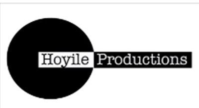
Jade made our production logo on Photoshop. We liked this as it is really simple and it is in black and white which matches our film. We used the name Hoyile as it's Tiffany's name in Chinese and it sounds good and is unique. We chose a serif font which makes it look more professional and mature.

This is the logo Jade made for the studio. The initials, P.E.J stand for Prada, Emily, Jade as Tiffany had her name as the production company. It is quite colourful and eye catching and here we have used a sans serif font which contrasts the other logo. It adds a sense of informality however, I think it still looks quite professional.
Wednesday 9 April 2014
Second shoot
This time we attempted to film some of Simran's scenes. This shoot went better as we now knew to do more shots so we have a wide range to choose from eliminating the chances of having to reshoot. However the tilt shot we attempted proved very difficult to do as it was hard to do it without the camera shaking. We tried to stabilise it when editing but it still didn't work out very well so we decided to get rid of that shot and think of something different. This is has taught us that what we planned to do might not work so we are going to have to think of different things that can still work within what we want our product to look like.
First shoot
We did this with Shauna and Jack as we wanted to get their scenes done. We got a few good shots and it gave us a good idea about how to film and use the camera effectively. This also gave us the chance to set up the room the way we wanted which meant every other time we filmed we knew how to set everything out. However, we didn't use any of the shots from this shoot as they weren't what we were hoping e.g the actors look at the camera and the camera moves quite a lot in some of the shots, but it has given us a good idea as to what we want to do to acheive our ideas.
Red
After watching sin city, we wanted our film in black and white as that is the main convention of film noir anyway however excluding the colour red. We wanted our antagonists to have something red on them as it connotes danger. We think this will look really good in our title sequence and it can also help our audiences understanding of the characters. However, this has proved very difficult when it has come to editing so we have had to abandon this idea and just have our sequence in black and white.
Subscribe to:
Posts (Atom)